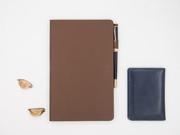
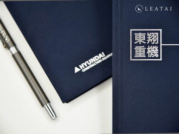
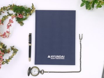
The Metal Research Center, in addition to its professionalism, also delivers a very high level of customized design, leaving a lasting impression every time. It is highly recommended once again.
PRODUCTS
OEM
At first glance, the playful design hides beneath a calm exterior, eager to reveal itself. The customization begins with the introductory page, showcasing meticulous attention to detail. This high level of craftsmanship is highly recommended.
The edges and top and bottom are trimmed perfectly, giving a simple appearance, but the process is much more complex than usual. It includes built-in pocket pages, making it an attractive and practical planner.
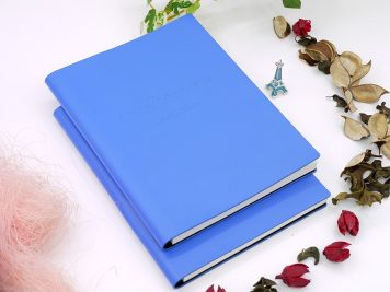
The brand logo is debossed on the black cover, creating a subtle light and shadow effect visible only from certain angles. This understated approach emphasizes practical functionality.
A leading Japanese building materials group offers an exquisite hardcover book and adds a customized paper box, enhancing the sense of ceremony and making the effort feel more thoughtful.
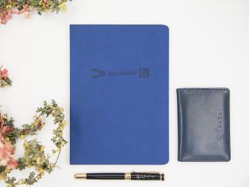
Japan’s leading building materials group, LIXIL, has unsurprisingly high standards for quality. The selection of subdued colors and custom private printing all demonstrate a strong emphasis on quality.
Brand image is crucial in the health and medical industry. Inseed uses high-quality art paper, and the logo’s reversed silver foil stamping is outstanding, leaving a solid impression.
The texture of the high-quality art paper, combined with the vintage-style full-color printing, instantly creates an antique book feel. Its structure lets it lay completely flat quickly, selling very well.
The large laser engraving area solves the issue of presenting fine lines that cannot be achieved with foil stamping or debossing. Through a unique processing method, the lines are perfectly rendered without distortion.
The already beautiful full-color printing, combined with a partially copper-gold logo, truly amazed the editor. It can almost be described as museum-grade craftsmanship and is highly recommended for collection.
Mitsuzaka Design draws inspiration from street graffiti style, a rare and trendy design with creativity. The inner pages are custom-printed, creating a robust and youthful vibe.
Renowned food manufacturer Creation Food must strictly ensure food safety. Its image is steady and understated, with no flashy effects, conveying a down-to-earth brand impression.
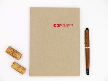
The meaning of travel varies for each person, but the common theme is the spontaneity of adventure, which helps one understand the deeper meaning of life.
Renowned EPS manufacturer Jiabao has chosen youthful colors to convey that a long-standing history can still maintain a light and innovative image, suggesting a strong sense of heritage.
Due to its complexity, the hand-stitched antique book method is rarely produced in the market. It requires purely manual binding, making it a creation that genuinely burns with passion and dedication.
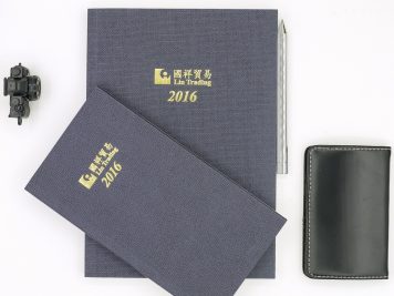
The subdued color scheme directly conveys a reliable image, with the brand name presented in gold foil stamping. Custom printing is a striking metaphor for excellent quality.
Color printing can fully unleash creativity, accurately conveying the brand image. The partial gloss effect is only visible from certain angles.
A significant challenge is creating a soft-hardcover planner while maintaining a spine gap without an inner cardboard layer. This task requires extensive customization experience and expertise, making it highly difficult.
By applying partial gloss on the musical notes and using fine matte as a base, the art paper cover becomes more durable, offering excellent tactile and visual effects.
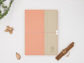
It’s rare for a tech company to customize an entire book in a pinkish design, but it turned out surprisingly well. It is structured, stylish, and gives off a clean and sharp impression, genuinely leaving a lasting impact.
The charitable organization I Will Share Association chose warm tones paired with a red logo to convey a positive force. The inner pages feature custom printing, ensuring high-quality standards.
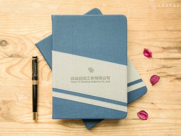
Known as a professional laser cutting and sheet metal factory, Quanyi is often perceived as very traditional and conservative. However, Chuan Yi showcases a surprisingly refined aesthetic, skillfully balancing various elements.
As a representative of a large state-owned enterprise, CPC uses youthful colors to showcase innovative ideas, gradually changing the traditional perception—a recommended exemplary model.
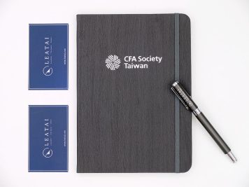
The subdued gray color is very fitting since the association’s image is at stake. The inner pages are custom-printed, and the cover is made of premium synthetic leather, giving the overall appearance a sense of stability and refinement.
Who would have thought that white, gold, and red would combine to be so stunning? Like the brand, which has a unique vision, this planner’s incredible aesthetic impresses everyone.
A gold-themed faux leather hardcover planner with bold color usage and custom-printed inner pages results in a remarkably exquisite product resembling a work of art.
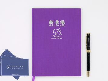
As a commemorative item for the 50th anniversary of this long-established conglomerate, a striking purple background was chosen, with the logo presented in silver foil, making a solid impression.
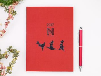
Adorable cartoon animals and a recognizable logo represent the brand’s primary business. The first impression is super cute and playful. Combined with Dutch cloth material, it feels very premium.
Adorable cartoon animals and a recognizable logo represent the brand’s primary business. The first impression is super cute and playful. Combined with Dutch cloth material, it feels very premium.
The 16K hardcover planner, nearly A4 in size, offers numerous features for writing and recording, akin to the brand’s steady operation that does not overlook any detail.
If frequent use at the processing site is required, A4 or 16K sizes are suitable choices, making recording everything needed for work convenient.
The sizeable multinational bank Standard Chartered produces a hardcover planner yearly to represent its professional image. These planners are understated yet practical, making them highly sought after for meetings or as gifts.
Representing the national image, TAITRA spares no effort. For different exhibition periods, various themes are presented on the custom planners, showcasing unique attention to detail.
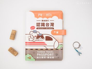
Adorable chibi-style artwork, with printing on leather being a challenging processing method, is a must-have for railway enthusiasts.
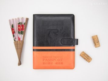
From a distance, it resembles the traditional colors of a train, making it ideal for use as a passport cover while traveling. It’s a collectible keepsake worth having.
As one of the critical pillars of Taiwan’s technology industry, the company’s logo is vibrant and distinct, symbolizing its prominent role in the sector. It is a name recognized by all, shining brightly within the industry.
The electronics industry often feels cold and impersonal, but this design exudes warmth. The brand name is presented in a literary and artistic font, making it a very human-centered brand.
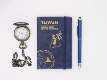
The palm-sized dimensions make it compact and practical. Its cute and lively design fits easily in a bag without any burden. Highly recommended by female colleagues, it is in high demand.
The 48K planner is approximately palm-sized, making it portable. This size is highly recommended for customizing the original writing tools into a luxury visual experience.
The deep blue gives a stable impression, much like the Military Police Command, emphasizing discipline and image. With a touch of mystery, it is an indispensable unit for maintaining national security.
A large multinational restaurant group with renowned brands such as KFC and Pizza Hut, it is known for its highly successful operational model. The unique and memorable dishes introduced annually leave a lasting impression.
Based on its expertise in stone-related technologies, the company actively develops deep-sea water application technologies and ventures into the cultural and creative industries, earning great admiration.
A large FinTech enterprise in financial flow, its core culture is centered on value innovation and practicality. The style balances humanity and warmth, being relatively low-key and modest yet with considerable strength.
The association highly values professionalism, demonstrates technical strength, and emphasizes a stable and reliable image. This makes it a trustworthy presence.
Guardians of electricity safety and maintaining society’s normal functioning are crucial in today’s environment of energy scarcity. Let’s support Taiwan together.
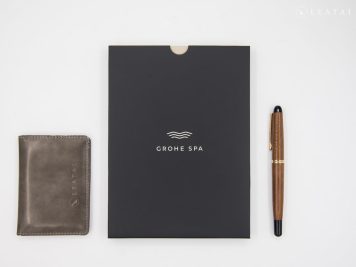
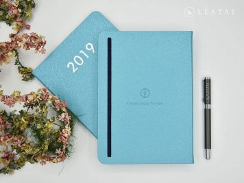
We take the spirit of “Be like water” as its guiding principle and use a lake green color scheme as its central theme, subtly embodying the brand’s image. This approach is akin to the profound wisdom in the saying, “Be water.”
TUV Rheinland is committed to creating a harmonious future where humans and the environment coexist. This brand image is presented with great elegance and comes packaged in a paper box, nearly matching the standards of a high-end gift box.
The Metal Research Center, in addition to its professionalism, also delivers a very high level of customized design, leaving a lasting impression every time. It is highly recommended once again.
At first glance, the playful design hides beneath a calm exterior, eager to reveal itself. The customization begins with the introductory page, showcasing meticulous attention to detail. This high level of craftsmanship is highly recommended.
The edges and top and bottom are trimmed perfectly, giving a simple appearance, but the process is much more complex than usual. It includes built-in pocket pages, making it an attractive and practical planner.
The brand logo is debossed on the black cover, creating a subtle light and shadow effect visible only from certain angles. This understated approach emphasizes practical functionality.
A leading Japanese building materials group offers an exquisite hardcover book and adds a customized paper box, enhancing the sense of ceremony and making the effort feel more thoughtful.
Japan’s leading building materials group, LIXIL, has unsurprisingly high standards for quality. The selection of subdued colors and custom private printing all demonstrate a strong emphasis on quality.
Brand image is crucial in the health and medical industry. Inseed uses high-quality art paper, and the logo’s reversed silver foil stamping is outstanding, leaving a solid impression.
The texture of the high-quality art paper, combined with the vintage-style full-color printing, instantly creates an antique book feel. Its structure lets it lay completely flat quickly, selling very well.
The large laser engraving area solves the issue of presenting fine lines that cannot be achieved with foil stamping or debossing. Through a unique processing method, the lines are perfectly rendered without distortion.
The already beautiful full-color printing, combined with a partially copper-gold logo, truly amazed the editor. It can almost be described as museum-grade craftsmanship and is highly recommended for collection.
Mitsuzaka Design draws inspiration from street graffiti style, a rare and trendy design with creativity. The inner pages are custom-printed, creating a robust and youthful vibe.
Renowned food manufacturer Creation Food must strictly ensure food safety. Its image is steady and understated, with no flashy effects, conveying a down-to-earth brand impression.
The meaning of travel varies for each person, but the common theme is the spontaneity of adventure, which helps one understand the deeper meaning of life.
Renowned EPS manufacturer Jiabao has chosen youthful colors to convey that a long-standing history can still maintain a light and innovative image, suggesting a strong sense of heritage.
Due to its complexity, the hand-stitched antique book method is rarely produced in the market. It requires purely manual binding, making it a creation that genuinely burns with passion and dedication.
The subdued color scheme directly conveys a reliable image, with the brand name presented in gold foil stamping. Custom printing is a striking metaphor for excellent quality.
Color printing can fully unleash creativity, accurately conveying the brand image. The partial gloss effect is only visible from certain angles.
A significant challenge is creating a soft-hardcover planner while maintaining a spine gap without an inner cardboard layer. This task requires extensive customization experience and expertise, making it highly difficult.
By applying partial gloss on the musical notes and using fine matte as a base, the art paper cover becomes more durable, offering excellent tactile and visual effects.
It’s rare for a tech company to customize an entire book in a pinkish design, but it turned out surprisingly well. It is structured, stylish, and gives off a clean and sharp impression, genuinely leaving a lasting impact.
The charitable organization I Will Share Association chose warm tones paired with a red logo to convey a positive force. The inner pages feature custom printing, ensuring high-quality standards.
Known as a professional laser cutting and sheet metal factory, Quanyi is often perceived as very traditional and conservative. However, Chuan Yi showcases a surprisingly refined aesthetic, skillfully balancing various elements.
As a representative of a large state-owned enterprise, CPC uses youthful colors to showcase innovative ideas, gradually changing the traditional perception—a recommended exemplary model.
The subdued gray color is very fitting since the association’s image is at stake. The inner pages are custom-printed, and the cover is made of premium synthetic leather, giving the overall appearance a sense of stability and refinement.
Who would have thought that white, gold, and red would combine to be so stunning? Like the brand, which has a unique vision, this planner’s incredible aesthetic impresses everyone.
A gold-themed faux leather hardcover planner with bold color usage and custom-printed inner pages results in a remarkably exquisite product resembling a work of art.
As a commemorative item for the 50th anniversary of this long-established conglomerate, a striking purple background was chosen, with the logo presented in silver foil, making a solid impression.
Adorable cartoon animals and a recognizable logo represent the brand’s primary business. The first impression is super cute and playful. Combined with Dutch cloth material, it feels very premium.
Adorable cartoon animals and a recognizable logo represent the brand’s primary business. The first impression is super cute and playful. Combined with Dutch cloth material, it feels very premium.
The 16K hardcover planner, nearly A4 in size, offers numerous features for writing and recording, akin to the brand’s steady operation that does not overlook any detail.
If frequent use at the processing site is required, A4 or 16K sizes are suitable choices, making recording everything needed for work convenient.
The sizeable multinational bank Standard Chartered produces a hardcover planner yearly to represent its professional image. These planners are understated yet practical, making them highly sought after for meetings or as gifts.
Representing the national image, TAITRA spares no effort. For different exhibition periods, various themes are presented on the custom planners, showcasing unique attention to detail.
Adorable chibi-style artwork, with printing on leather being a challenging processing method, is a must-have for railway enthusiasts.
From a distance, it resembles the traditional colors of a train, making it ideal for use as a passport cover while traveling. It’s a collectible keepsake worth having.
As one of the critical pillars of Taiwan’s technology industry, the company’s logo is vibrant and distinct, symbolizing its prominent role in the sector. It is a name recognized by all, shining brightly within the industry.
The electronics industry often feels cold and impersonal, but this design exudes warmth. The brand name is presented in a literary and artistic font, making it a very human-centered brand.
The palm-sized dimensions make it compact and practical. Its cute and lively design fits easily in a bag without any burden. Highly recommended by female colleagues, it is in high demand.
The 48K planner is approximately palm-sized, making it portable. This size is highly recommended for customizing the original writing tools into a luxury visual experience.
The deep blue gives a stable impression, much like the Military Police Command, emphasizing discipline and image. With a touch of mystery, it is an indispensable unit for maintaining national security.
A large multinational restaurant group with renowned brands such as KFC and Pizza Hut, it is known for its highly successful operational model. The unique and memorable dishes introduced annually leave a lasting impression.
Based on its expertise in stone-related technologies, the company actively develops deep-sea water application technologies and ventures into the cultural and creative industries, earning great admiration.
A large FinTech enterprise in financial flow, its core culture is centered on value innovation and practicality. The style balances humanity and warmth, being relatively low-key and modest yet with considerable strength.
The association highly values professionalism, demonstrates technical strength, and emphasizes a stable and reliable image. This makes it a trustworthy presence.
Guardians of electricity safety and maintaining society’s normal functioning are crucial in today’s environment of energy scarcity. Let’s support Taiwan together.
We take the spirit of “Be like water” as its guiding principle and use a lake green color scheme as its central theme, subtly embodying the brand’s image. This approach is akin to the profound wisdom in the saying, “Be water.”
TUV Rheinland is committed to creating a harmonious future where humans and the environment coexist. This brand image is presented with great elegance and comes packaged in a paper box, nearly matching the standards of a high-end gift box.


